Shape Basics: Characters From Shapes

Tutorial Tuesday

When creating characters try to work out the overall shape first. Explore different shapes and don’t be afraid to differ from the norm or what you are used to seeing. Have fun and doodle. Let’s get started with sketching some shapes.

Sketch out some basic shape ideas.

shape-basics-language4.jpg

Add character details to the shapes.

shape-basics-language1.jpg

Clean-up the sketch and you are left with a fun character.

shape-basics-languge2.jpg

Thanks for stopping by, see you next time. Remember to like and follow me for more art tutorials.


What's Your Motivation Style?

Monday Motivation

Here are some common motivation styles that drive people to work hard and achieve success.

Money and Rewards: We all want to get all the shiny new stuff. The stuff isn’t really important but maybe its the feeling of getting the new stuff that is driving you.

Desire to be the Best, Win: Think of world record athletes, to be the best of the best they dig hard and sacrifice a lot. There can only be one at the top.

Helping Others: For some it’s changing the lives of the people around them and making a difference. Maybe you have been there and know the feeling so helping others motivates you to keep going.

Power and Fame: Politicians and business men want to become powerful leaders.They are driven to achieve greater power and fame in life.

Recognition: To prove that either they are right or someone is wrong. Sometimes it’s just to getting recognition from others.

Passion: Think about it, there are times when you feel so passionate for something that you are willing to sacrifice for it.

You can be driven by more than one motivation style but there will always be a dominant style. Find out which style motivates you the most. Create a plan to drive your success with that style of motivation.

motivation-style1.jpg

Thanks for stopping by, see you again next time.
Remember to like and follow for more great art tutorials.


Animation Background Painting Made Easy

Friday Fun

Today will be a little different from the usual Friday Fun but we are still going to have some fun. We are going to replicate an animation background painting from a Chuck Jones cartoon. I love cartoons from this era, they had such fun backgrounds and the music was great. Just not the same with today’s cartoons. Before we get started let’s take a quick look at Chuck Jones.

Chuck Jones:
An American animator, director, cartoon artist, screenwriter, and producer. His career spanning over 60 years, Jones made more than 300 animated films, winning three Oscars as director and in 1996 an honorary Oscar for Lifetime Achievement.

Supplies:
acrylic paint (phthalo blue, purple, orange, lemon yellow, black, and white)
canvas or heavy duty painting paper
brushes

animation-background-painting1.jpg

Ok let’s get started. Get your supplies ready and let’s go…

Start with painting the back ground first. Using phthalo blue, purple and a little white paint the entire canvas and let it dry.

animation-background-painting2.jpg

Add stars and moon. Flick the white paint to simulate stars in the sky. Paint the moon with white and lemon yellow and let dry.

animation-background-painting3.jpg

Draw the houses and T.V. antennas and then paint them black. Let this dry and then paint white for the windows. (we do this so color will be bright and show up when we are painting over another color)

animation-background-painting-all3.jpg

Finish the the windows with orange and yellow. There you go you now have your own animation background painting.

animation-background-painting7.jpg

Thanks for stopping by, see you next time. Remember to follow and like for more art lessons like this one.


Find The Right Colored Pencils For You

Thrifty Thursday

It’s Thursday and we are being thrifty but not cheap. Color pencils are one of the art supplies where you still need to watch out for quality, cheaper is not always better. Not to worry I am not going to suggest go out and buy the most expensive., there is a happy medium. First let’s go over what makes a quality colored pencil and the types of colored pencils.

Quality in colored Pencils:
Rich in color/pigmentation - bright, clean colors
Highly lightfast - does not fade easily
Easily layered - can color over other colors t build layers
Limited Breakage - does not break easily

Types of Colored Pencils:
Colored pencils come in a variety of grades. Student grade are usually cheap don’t have as much pigment or are highly lightfast. Artist grade cost a little more and have more pigment and blend a little better. Professional grade are the most expensive with rich colors and great lightfastness.

You can get color pencils that are wax based and oil based. These will behave differently and it’s a good idea to try out several different brands and types of colored pencils before investing in a set.

color-pencils1.jpg

My suggestion for price, quality and variety of colors is the Prismacolor Premier color pencils. They are a really good pencil for beginners and some professionals prefer them as well.

It really comes down to personal taste so buy a few individual pencils from different brands to find one you prefer. You can always mix the brands.

Thanks for stoping by and see you next time. Remember to like and follow

*This is not a sponsored blog these are just some of the products that I personally use. You can always explore and find other options.

Hand Design: Masculine vs. Feminine vs. Baby

Tutorial Tuesday

Hello and welcome to today’s tutorial, hands. These are some of the things I think about when I’m designing hands for a character.

Over all hand shape and proportions.

hand-proportions1.jpg
 

What type of wrist connects to the hand.

hand-proportions2.jpg
 

What are the length and shape of the fingers.

hand-proportions3.jpg

These are just some suggestions and not rules. Try it out and see what you can come up with.

Thanks for stopping by and see you next time. Remember to like and leave a comment.


See Your Skills Improve

Monday Motivation

Feel like your drawing is a failure? It’s ok to feel you’re not where you want to be in your art career, but don’t dwell on it. Work towards your goals and practice your skills with intent. If you just had a bad drawing take out one of your older drawings and take a look at it. I like to keep a drawing or painting of a time I thought was successful and then go back and look at it again a year later and compare it to what I’m doing today. Wow such a difference in my approach and what I thought was successful. I try to do this every year so I can really see the improvement and it keeps me going.

Thanks for stopping by and see you next time. remember to leave a comment and like our page.

MM-see-your-improvement.jpg
 

Easy Blind Contour Drawing

Friday Fun

Thanks for coming by we have a fun one for today. We are going to do some blind contour drawing.

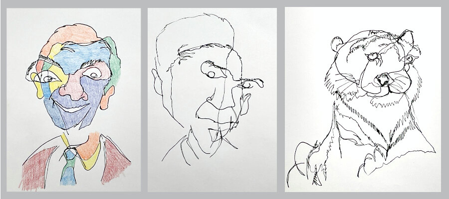
Blind Contour: a line drawing without looking at the paper and keeping the pencil on the paper the whole time.

The point of the blind contour is not to have a pretty drawing but to focus on what you are seeing. It helps to build eye hand coordination and can be silly so you loosen up and have some fun. Remember it’s Friday Fun so don’t worry about the outcome just enjoy the creative process. Here are some things we need before we get started.

Supplies:
pencil (make sure its dark enough) or pen
paper
timmer
*colored pencils or paint (this is optional)

Preparation:
Find a subject to draw. This can be anything you want, just have it ready.
Tape done the paper so it does not move when drawing.

Rules:
Set a timer for 5 - 10 minutes
Do not look at the paper only on the subject (what you are drawing)
Once the pencil touches the paper you cannot remove it until you are done.

Ok let’s get started. Try a few to see how different each one can be. You can even color your drawing when done.

FF-blind-contour-drawing.jpg

Like and leave a comment and remember to follow for more art lessons and tips.

Thanks for stopping by, see you next time.


Inexpensive Canvas for Beginners

Thrifty Thursday

So you decided to take up painting and started looking for all of your supplies. You walk into your neighborhood art store see the prices of painting supplies and almost pass out. “What?!,” you say. “Are you kidding me?!” Yes painting supplies can cost a lot of money but it’s ok you don’t need the most expensive supplies to get started. Canvas ranges in value and types so lets take a look at your options.

Canvas Types:
Canvas paper - heavy weight paper that is coated to handle paint (make sure its made for your paint type: oil, acrylic or watercolor) Some may need to be prepped before painting.
Canvas panels - thin heavy weight cardboard that is covered with primed canvas on one side, ready to paint.
Masonite - thin wood pulp panel (needs to be primed with gesso before painting)
Stretched Canvas - wood frame covered with canvas, usually primed and ready to paint.

Canvas panels in a value pack for beginners is my suggestion. This will be the least expensive option but still have the canvas feel. You will be able to get several panels to work on. Keep to the smaller sizes to keep the cost down and your motivation going, working on a big painting and not finishing because of the size is not what you want.

canvas-for-beginners1.jpg

Stretched canvas in value packs is my next choice for beginners. This gives the real feel of canvas and you can get a few canvases to work on. Once again keep the size on the smaller side.

canvas-for-beginners2.jpg

Thanks for stopping by, see you next time. Remember to click the like button and leave a comment below.

*This is not a sponsored blog these are just some of the products that I personally use. You can always explore and find other options.


Value Basics for Beginners

Tutorial Tuesday

Let’s get started with some basics for values.

Value: how light or dark something is.

Value Is used in drawing and painting to depict light and shadow. These values define form giving the illusion of depth and space.
Value has the ability to define: Mood, atmosphere, composition, and the believability of the image. If your values are inaccurate your drawing or painting falls apart. If you have correct values in your drawing/painting you can use any color you want and it will look correct.

It’s a good idea to practice a value scale, white to black scale with each step filled with grey getting darker the closer to black the square is.

Try it out: make a row of 1 inch squares, 5 to 10 squares long, keep the first square white and the last square black. Each square should be darker grey as they get closer to the black square. Try to keep a consistent change in value between each square.

value-basics1.jpg

Another practice is to create another value scale but this time smooth transitions from light to dark.
Try it out: make another value scale next to your previous value scale and start with the dark side and work you way back to white.

value-basics2.jpg

After you done a these scales try a small drawing using value only. As you are drawing have the values scales you have completed next to you so you can refer to them as you draw.

value-basics3.jpg

Thanks for stopping by and see you next time. Remember to click the like button and leave a comment below.


Find Your Morning Spark

Monday Motivation

Hello everyone and thanks for stopping by, remember to click the like button and leave a comment below.

Find something you like, it can be anything to get you up and going in the morning. We all have something that gets us excited and happy to start our day. For some its going on a bike ride, sketching or listen to your favorite song. The point is to start your day with a positive thought and feeling. When ever we have something we are excited about we tend to wake up feeling better and ready.

So look for your morning spark, could be just one anything simple and try to have different kind of morning spark every other day or 2 to 3 different kinds in a week. Find the time to do it every day even just for a little bit, so you can feel satisfied that you started your day with something you love and enjoy. This should help make you feel good and keep you going with your routine the rest of the day.

find-your-spark.jpg

Thanks for stopping by and see you next time.

Pointillism Pet Portrait

Friday Fun

Yay it’s Friday and we have another fun project for today. This week our inspiration is from Pointillism.
~Remember to follow us for more great art tutorials.~

Pointillism: was the application of paint in carefully placed dots of pure, unmixed color. (Points of pure color) These dots would be blended by the viewer’s eye to create a striking image. Pointillism was a radical painting technique explored by Georges Seurat and Paul Signac in Paris in the mid-1880s.

Let’s jump in and have some fun.

Supplies:
pencil & eraser
small canvas or canvas paper
cheap acrylic paints & paint brushes
Colors can be anything you want.

Draw out your pet portrait, if you don’t have a pet you can use free domain references found on the internet. Have fun with it, don’t worry about the little details you wont see them in the final painting. Remember we are being inspired by Georges Seurat.

Start with the background. Don’t complete it just get a good amount of the background covered with color. I like to pick the main color for an area to start with.

pointillism-pet-portait1.jpg

Start working on the pet area when a good amount of coverage is on the background. Working the whole painting at the same time so you can see how the colors look together. This time I started with the light areas so I could map them out and keep them light.

Add middle value colors in pet area. Again I am picking the main color to start filling in the area of the pet.

pointillism-pet-portrait2.jpg

Go bold with your colors, this will really start to bring your painting to life.

Add the darks to complete your painting.

pointillism-pet-portrait3.jpg

Congratulations you have completed a Seurat pointillism inspired painting.
If you have enjoyed this tutorial please click the like button and leave a comment below.

Thank you for stopping by and see you next time.


Best Acrylic Paints for your Money

Thrifty Thursday

Hello everyone and thanks for stopping by remember to leave a comment and follow for more art tips.

Usually on Thursdays I talk about inexpensive art supplies but today is going to be a little different. We are going to talk about acrylic paint and cheaper is not necessarily better when staring out and learning about color and how to paint. So we will review acrylic paints that are the least expensive but have decent quality needed to learn color and how to paint. Everyone is different so I would suggest to buy only a few colors (blue, red, yellow and white) to try out the brand you choose and see if it works for you. The colors you use matter but that is a topic (color theory) for another post, it’s a lot of information.

What to look for when picking out your acrylic paint:
opacity - how well the paint covers the surface and another color
brightness - how much pigment which makes the color (more pigment better color)
colorfastness - how much will the colors fade over time when exposed to light.

Grades of acrylic paint:
Student grade have the lowest pigment and cheaper ingredients.
Artist grade often use the same pigments as professional paints, but use less.
Professional are the best quality grade. With highest quality pigments and best ingredients.

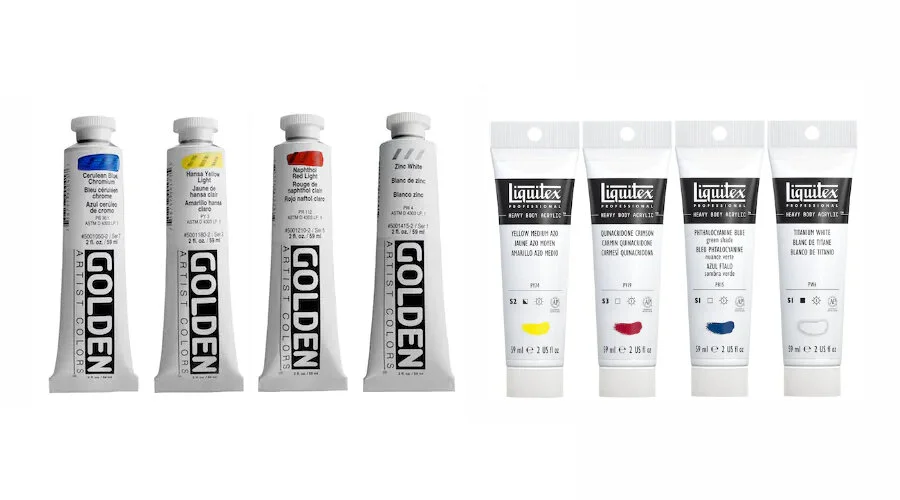
With this in mind my suggestion would be Utrecht Artists’ or Windsor & Newton Professional acrylic paints. They cover well and the pigments are bright, they mix pretty well also.

best-acrylic-paints1.jpg

If you want to spend a little more and get a more professional acrylic paint try Liquitex Professional or Golden Heavy Body Artist acrylic paints. They cost more but I think they are worth it for really learning color and painting. M. Graham Artists' acrylic paints is another professional brand but they cost a bit more and I haven’t noticed much difference from Liquitex or Golden.

best-acrylic-paints2.jpg
best-acrylic-paints3.jpg

This is not a sponsored blog these are just some of the products that I personally use. You can always explore and find other options. Remember it’s how the paint feels to you and if you are comfortable using that particular brand.

best-acrylic-paints4.jpg

Thanks for stopping by and wee you next time.

*This is not a sponsored blog these are just some of the products that I personally use. You can always explore and find other options.


Value Studies for Paintings

Tutorial Tuesday

I want to thank you for stopping by. Please leave a comment or question and follow me for more art tips. Let’s get started.

When approaching a new painting it’s a good idea to do some quick studies before jumping right in. This helps with figuring out design, values and color. Once you have an idea of what you are going to do the process will be smoother with less stress.

A simple approach to pre-viewing how the final painting will look. All studies should be small (about 2 X3 inches) and relatively quick.

Break values down into 3 values, only 3 values. Light, mid-tone, and dark. This will force you to really see the shapes and overall tone. The painting can have an overall light , dark tone, low contrast or high contrast. Figure that out in the simplified value study.

simplify-values1.jpg
 

Create another study but with more values (5 values this time) and add some texture. This study will be closer to a black & white version of the final painting.

Make adjustments this is still just a study so try things out.

simplify-values2.jpg
 

Paint a color study with all values. When you are happy with what you plan on doing go ahead and make your final painting.

simplify-values3.jpg

Thanks again for stopping by, see you next time.


Enjoy the Little Moments of Magic

Monday Motivation

magic-moments.jpg

Little moments of magic happen throughout our journey. Maybe you finally drew the perfect hand or created an amazing layout, or a drawing really told a story that you have been trying to get right. These are all moments where everything lined up and the magic happened. Don’t just pass over them especially if you have been working on that skill for a long time. If you ignore your successes you will not see your growth.

Take a little time to recognize it, appreciate it and continue to grow. You have achieved your goal, it feels good. Carry that feeling onto your next challenge.

Art is a journey not a destination enjoy it for all it’s worth.

Thank you for stopping by, see you next time.


Paint Like Picasso

Friday Fun

Today we are letting go of all the rules and we are going to have fun and be inspired by Pablo Picasso.

Don’t worry today is about having fun and feeling free. Here is a very brief summary of Picasso.

Pablo Picasso was considered one of the greatest artists of the 20th century. He is known for pioneering Cubism, alongside Georges Braque, he also invented collage and made major contributions to Symbolism and Surrealism. Picasso constantly reinvented himself radically changing his style. Some of stages of style include Blue Period, Rose Period, Cubism, and Classical Period.
Alrighty let’s get to it.

Colors:
yellow ochre
lemon yellow
vermilion
purple
cerulean blue
phthalo blue
monastral green
black
white

Supplies:
pencil & eraser
small canvas or canvas paper
cheap acrylic paints & paint brushes

Draw out the face and have fun with it, don’t make it too realistic looking. Remember we are being inspired by Picasso.

Paint the background. I painted the yellow ochre color first and then the black on top. It’s much easier this way.

paint-like-picasso1.jpg
paint-like-picasso2.jpg

Paint the hair and clothes. Keep the clothes a muted brown color so the face really stands out in the final painting.

Paint the cool (green & blues) side of the face, roughly blending the two colors. Remember it’s not a perfect gradual blend.

paint-like-picasso3.jpg
paint-like-picasso4.jpg

Paint the warm (red & yellows) side of the face, again roughly blending the two colors.

Pant the eyes and lips. We are almost there and it’s already looking great.

paint-like-picasso5.jpg

Finish with painting the black line around all of the objects. This really makes it pop Picasso style.

paint-like-picasso6.jpg

Congratulations you have completed a Picasso inspired painting.

Thank you for stopping by and see you next time.


Great Beginner Watercolor Paints

Thrifty Thursday

Watercolor painting can be fun and expensive but there are affordable options out there. Let’s take a look at the different watercolor paint types.

Watercolor paints can be liquid or solid, tubes (liquid) or pans (solid). There are a variety of colors and they vary depending on the brand. You can buy a set of colors or select individual colors that fit your needs.

watercolor-paints2.jpg

An affordable way to go is with a pan set that has the necessary colors for you to get started. Another option is to get a few select colors to start with. If just starting out I would suggest getting a set so you don’t have to worry about selecting colors.

Once you are comfortable with watercolors and have decided you like painting move onto getting individual tubes so you can set up your color palette the way you like it.

Some inexpensive pan sets you can find: Prang, MeiLiang, or Winsor & Newton Cotman Water Colour (pocket) watercolor sets.  For the least expensive watercolor tube paints Winsor & Newton Cotman are a good start.

This is not a sponsored blog these are just some of the products that I personally use. You can always explore and find other options.

great-beginner-watercolor-paints.jpg

Thanks for stopping by, see you next time.

*This is not a sponsored blog these are just some of the products that I personally use. You can always explore and find other options.


Keep Perspective in Mind

Tutorial Tuesday

When sketching out your idea always try to keep perspective in mind so your elements line up or are placed in the sketch properly. This helps to keep realistic positioning and makes the sketch more believable even if you are cartooning. If you are having trouble seeing the perspective as you draw go ahead and add some grid lines to help you see. You can always remove them later for the final drawing.

keep-perspective-in-mind1.jpg
keep-perspective-in-mind2.jpg
keep-perspective-in-mind3.jpg
 

Tackle Imposter Syndrome

Monday Motivation

Imposter syndrome is the idea that your success is due to luck or good timing and not your skills or qualifications. At one time or another we have felt the imposter syndrome sneak up on us. A fear that you won’t live up to expectations. Most people have moments of doubt, that’s normal.

The trick is not let it get ahold of you, move on and continue to grow and achieve your dreams.


Here are some steps to overcome imposter feelings:

Learn to value constructive criticism, no one is perfect and it’s good to hear from outside of your own thoughts.

Expect to make mistakes especially when starting a new experience. Find a mentor who has been on a similar path to yours.

Stay focused on your own achievements, stop comparing yourself to others. Get off social media for a while and focus on you.

Feeling unsure doesn’t make you an imposter, it means you are learning.

Thanks for stopping by, see you next time.

tackle-imposter-syndrome.jpg
 

Easy Cardboard Roll Monsters

Friday Fun

Yes it’s Friday and we have another fun project for you to try at home. We are going to make cardboard roll monsters. Remember we are not looking for perfection but creativity so let’s have some fun.

roll-monsters1.jpg

Supplies:
cardboard rolls (can be empty paper towel rolls cut in half or empty bathroom tissue rolls)
extra piece of cardboard (to cut out arms and horns)
acrylic paint (any cheap paint will do)
paint brushes


Paint the cardboard rolls any color that you like for your monsters body. You may need to paint more than one coat of paint, let it dry in between coats.

roll-monsters2.jpg
 

Draw and paint the extra parts like arms or horns. It can be anything you want to add to your monster. Make sure they are fully dry before you cut them out and glue them on the body of your monster.

roll-monsters4.jpg
 

Paint on the face, make it any kind of face you want. You can have one eye or add as many as you want. Make sure each part dries before you paint the next to keep the paint from smudging.

roll-monsters5.jpg

Congratulations on your little monsters.
Thanks for stopping by and creating along with me.
See you next time.


Best Cheap Charcoal Pencils for Beginners

Thrifty Thursday

Charcoal pencils are another great tool when first starting out in art. They are very forgiving to use and you don’t need a ton to start with. Don’t worry about getting the most expensive charcoal pencils. Inexpensive brand pencils work just as well, sometimes even better than the expensive brands.

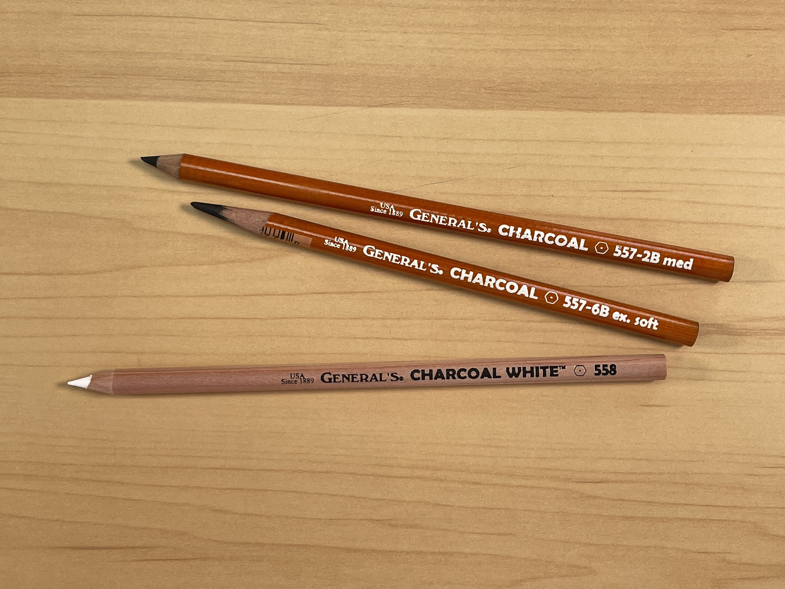
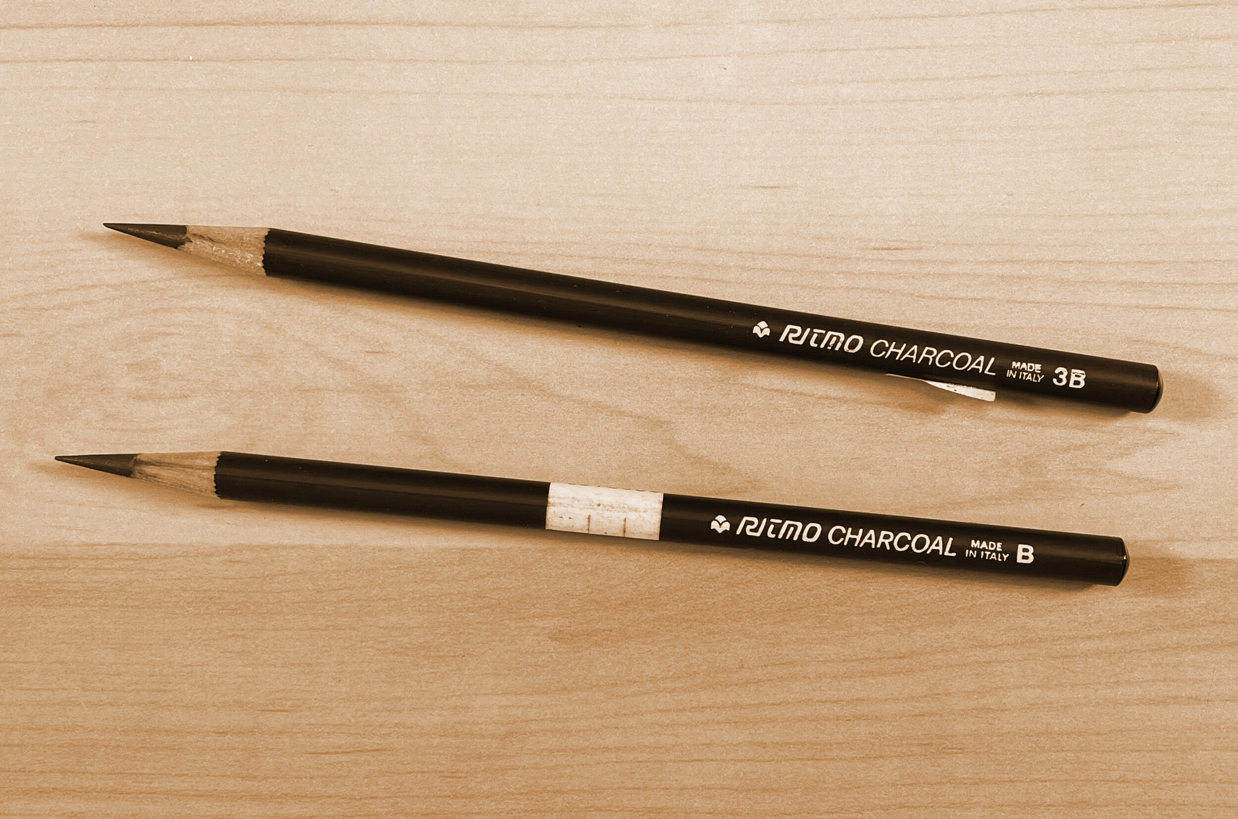
Just like with graphite pencils buy only a few different levels of hardness. In the past I was using the Ritmo brand but found they had changed and seemed to break more easily so I switched back to General’s, the brand I used in college.

When using your charcoal pencils if you feel like there are tiny rocks in the pencil or the pencil seems to just scratch the paper, sharpen your pencil to remove the hard part. If this continues or seems to happen often then you may need to switch brands.


Pencil Basics:

IMG_1085.jpeg

The numbers and letters on the pencils correspond with the hardness of the charcoal.

char-pen-ritmo.jpg

Pencil numbers with an “H” = harder pencils and make lighter lines
Pencil numbers with a “B” = softer pencils and make darker lines


Created with Generals charcoal pencils on toned paper

Created with Generals charcoal pencils on toned paper